Screenshots From The Past Year
One great thing about working with version control (here at Gambrinous Towers we love Subversion – and so would you if you just gave it a chance) is that you can go back and look at snapshots of your game as it was in the PAST. And that's just what I've been doing recently, rebuilding older versions of the game prototype to look at all the delicious progress that's been made. And I've decided to share the screenshots with you! Enjoy!
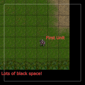 Revision 11. It didn't do much more than you can see here.
Here's the oldest build saved into our SVN repository, from November 2008, representing the first few weeks of getting my head around Flex and tiling. There was no animation or smooth scrolling yet, the little guy just jumped around on screen as you clicked on a target space.
By December 2008 I had cracked animating the unit (hilariously, instead of a walking animation he sticks his sword up and down as he moves), and locking the view to him and smoothly scrolling along as he moved.
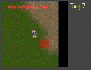
Revision 27. Glorious background tiles.
I didn't need those nasty guideline squares anymore so you can see Dan Cook's excellent background tiles in all their glorious detail here.
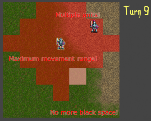
Revision 35. I'm not sure I can charge for this yet.
By March 2009 we really started to impress, as I added a SECOND UNIT to the prototype! I also finally cracked the 'only scroll when you aren't near the map corners, damnit' algorithm (a real head-scratcher), so the nasty black space was banished.
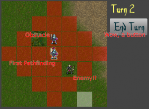
Revision 40. An enemy! Can I attack him? Ans: no
April 2009 and we've thrown in AN ENEMY plus a nasty-looking forest tile – you aren't allowed walk into either so this is where pathfinding was first added.
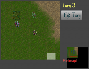
Revision 47. Your eyes are not deceiving you, that is a minimap alright.
Plus, a minimap! You could even click on it to jump the main view to that part of the map, which was pretty handy on this test map that extended beyond what you could see at once BY THREE TILES!
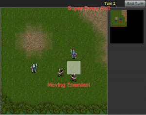
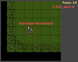
Revision 57. Added in a GUI, of sorts. Also AI.
By June 2009 the enemies have a mind of their own. All they do is move one square randomly on their turn, but luckily you can still call that AI. Bam, feature ticked!
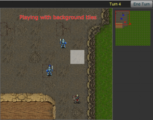
Revision 60. Sexy, sexy background tiles. Unf.
I also had a play around with the quite large number of different tile types, and built a section of map using them. There's still loads more varieties to play with but this gives you an idea of the high quality backgrounds you can make.
August 2009 sees a lot of vital improvements after spending some time designing our basic battle system. Zones of control are in (once you move next to an enemy you can't move further), and units now have stats & weapons & armour. Sure it's practically a full hard-core RPG at this stage.
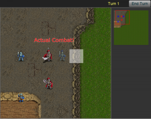
Revision 76. Combat is in… at last.
There was one key thing missing however – getting to finally attack those enemies! You can't really see it well in a screenshot, but damage floats upwards from the unit being attacked and disappears.
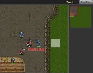
Revision 87. Health bars, though not the ones with nuts in them.
Health bars were a natural addition to this. Look closely and you can also see that death knight is counterattacking, wowee.
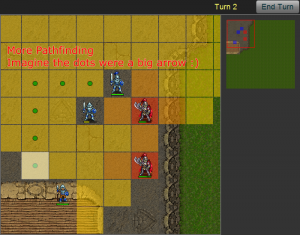
Revision 89. Long needed usability improvements.
September 2009 and there's a few more things going on under the hood that make playing it slightly more bearable, such as being able to click on an enemy to both move there AND attack him, including remembering which path you wanted to take to get to him. Those green dots would make a lot more sense if they were a snaking arrow, like they eventually will be.
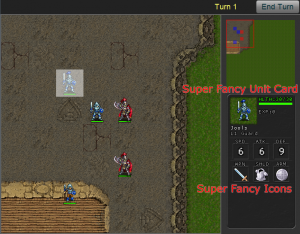
Revision 99. If you say it's super fancy it's automatically better.
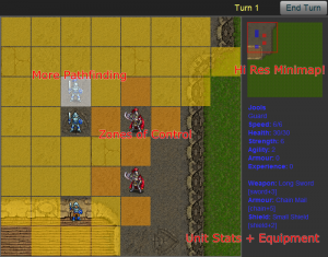
By November 2009 it was time to implement a better unit description card, one that shows up in the bottom right when you hover over a unit, so you can see their stats and equipment and (later) skills. Some super fancy icons were found to make this look better.
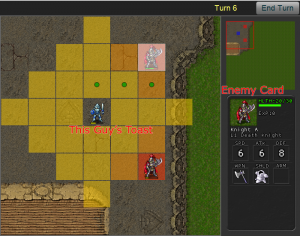
Revision 99 pt II. The test units are really stacked against you.
This is pretty much where it's at now. The next couple of months should bring this to a fully playable prototype of a single battle of the game, which will be a fantastic milestone to reach!
A note on graphics. Everything nice you see here (so you can leave out the nasty grey GUI stuff) is thanks to free graphics from the following sources:
- Background tiles from Dan Cook's fantastic range of free graphics for games. (There's more to pick from too, check out the full range)
- Unit graphics (including animation) from the open source game Battle For Wesnoth. (An excellent turn-based tactics game which you should definitely try out)
- Icons for armour & weapons from DeviantArt member Ails.
To all of you: please accept this hug as thanks!
 Thanks for reading! Now check out Guild of Dungeoneering,
a game I'm making where you build the dungeon instead of controlling the hero! \o/



5 Comments
This looks promising ;-)
Excellent stuff Colm, really cool to see the evolution of the game.
If you think Subversion is great, you should look at git, hg, or bzr they make Subversion look like it has down syndrome. dvcsftw.
Git is pretty easy to use. This is coming from a newb programmer.
This looks awesome! It's inspiring seeing the steady progress you are making.
Should check out karma kingdom on FB..graphics are pretty amazing. These graphics just don't really do much for me.