Creating the Scribble Effect in Guild of Dungeoneering
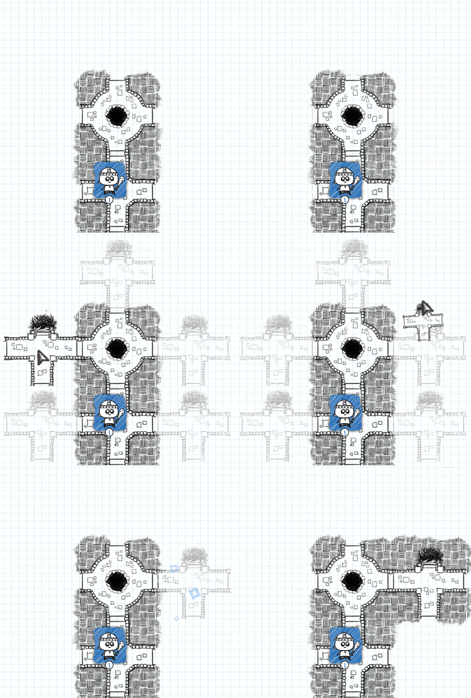
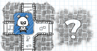
One of the big draws of Guild of Dungeoneering is the distinctive art style created by Fred; it really evokes that feeling of playing a paper and pencil style RPG, where you are sketching out your own dungeon maps. However we felt we weren’t doing that art justice in the transitions between picking a room card and it appearing on the page. Rooms simply faded in to a static image. We also weren’t really happy with the way the game was highlighting possible placement positions for new rooms, showing just question marks in valid locations when in the middle of the placement sequence, which was confusing for some players.
So when I joined the team one of my tasks was to try and implement solutions to these issues, eventually coming up with what I call the Scribble Effect.
The Scribble Effect
We knew we wanted to somehow mimic the rooms being drawn, by pencil, on to the screen. So I figured the best way, or at least the best way I knew of, would be to use image blending effects. Guild of Dungeoneering is slated to first release on Steam for PC & Mac, however the game is entirely built in Flash (in pure Actionscript to be more precise) primarily using the Flixel engine. So I would be able to use Flash’s built-in bitmap functions and blend modes to get the result I was aiming towards. I had used similar techniques in the past when creating dynamic fog-of-war systems, so I was confident enough in going for this approach.
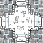
Looking at a single room tile, we can see it is made up of two main parts: the room itself, and its surrounding hatching. That hatching is made up of a ten by ten grid of alternating horizontal and vertical strokes, which is also aligned with the grid of the graph paper below. I decided to use this grid as the basis of the effect. At the games current fixed resolution each room tile is 150 by 150 pixels, making each small square of hatching 15 pixels square. These small squares were to be the basic building blocks.
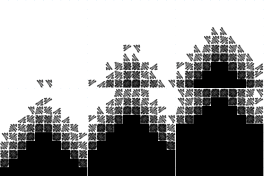
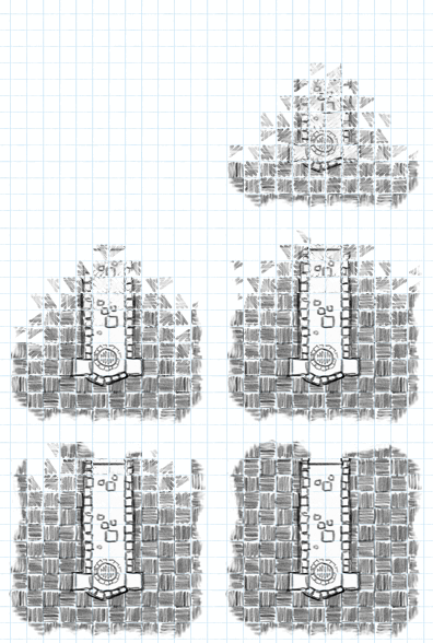
I created a very simple spritesheet consisting of four frames, with each frame being 15 by 15 pixels, with simple semi-transparent black scribble strokes. This would be used as a mask to progressively build up the effect on each grid square. When applied over 4 steps they would layer on top of each other and slowly reveal the actual image pixels.
I wanted the effect to grow out from the existing tiles. So when starting the effect I check to see where the neighbouring tiles are, if any, then pick a starting location based on the highest density. If starting from a corner, the effect will then spread diagonally out from that point. If starting from a side it will move across to the far side whilst also spreading perpendicularly in both directions from the middle of that side.
Setting everything up
The other main piece of setup is creating the various temporary display objects required to pull off the effect. The effect takes place on the final Tile object itself that is placed in the world; when the sequence is finished it will just hold the static room sprite, but will start out blank and contain a couple of temporary images and mask display objects as variables to enable the effect.
The first mask we use is a Flash Shape object with its default blank Graphics object. In Flash a Graphics objects is a simple canvas for drawing vector graphics (lines and shapes), but as well as allowing you to do solid and gradient colour fills you can also do a bitmap fill. With a bitmap fill, when you draw a shape the filled in contents will come from a portion of a supplied image. This can be useful when you want to do quick and cheap frame/spritesheet based drawing/blitting. As the effect will progress the scribble spritesheet will be drawn to the Shape, adding the appropriate frame in the appropriate position for the grid square currently being executed. With a fifth step added on the end to completely fill in the square this results in the mask filling up to become entirely opaque black.
This build-up sequence is queued up during the initial effect set up. Throughout the game we make extensive use of the TweenLite library from GreenSock for normal transformation tween animations but also for timing using its delayed function call features, and here we make extensive use of the delayedCall() function to enable the scribble effect. We loop through each of the one hundred squares and set up its initial delayed call to the masking function, with the appropriate delay for its position – the pattern of delays depends on from which point to grow out from. Then within the masking function, when called following each delay, the next delayed call step in the sequence is queued up for that position. For a basic effect that’s five hundred delayed calls.
public function startMaskEffect(phase:int = 1, delay:Number = 0):void {
  [...]
  switch(hi_index) {
    case 7: //bottom centre
      for (j = 9; j >= 0; j--) {
        d = delay + delay_per_step * (9-j);
        for (i = 0; i < 5; i++) {
          d += randomDelay(delay_per_step);
          maskTweens.push(TweenLite.delayedCall(d, updateAlphaMaskHalf, [ 4 - i, j, delay_per_step,
                          0, phase, steps, randomRotation()] )); //spread left
          maskTweens.push(TweenLite.delayedCall(d, updateAlphaMaskHalf, [ 5 + i, j, delay_per_step,
                          0, phase, steps, randomRotation()] )); //spread right
          if (phase == 2) { //hatching pass, check to start borders
            if (border_north && i == 0 && j == 0) {
              border_north.startMaskEffect(d, delay_per_step, false, true);
            }
            if (border_south && i == 0 && j == 9) {
              border_south.startMaskEffect(d, delay_per_step, false, true);
            }
            if (i == 4 && j == 9) {
              if (border_east) {
                border_east.startMaskEffect(d, delay_per_step, true);
              }
              if (border_west) {
                border_west.startMaskEffect(d, delay_per_step, true);
              }
            }
          }
        }
      }
      break;
    [...]
  }
}
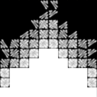
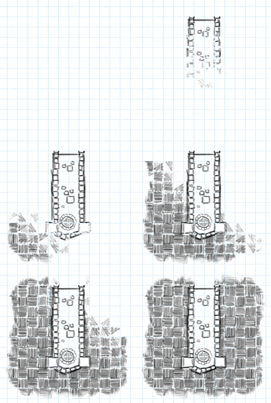
It is within these built up black areas of this first mask that we want the actual tile to be displayed, so this mask isn’t quite what we need. What we really need is the inverse so that we can erase the remaining areas from the full room image, another temporary object contained within the Tile. In the beginning everything is erased from the room each frame, then less and less needs to be removed until the sequence is complete and nothing is erased leaving just the full room tile image. This inverting, erasing and then copying of the modified contents of the room image to the Tile objects framePixels (and then resetting of the room image to its original state) is done in the Tile’s draw() function, called once per game frame when Flixel is ready to copy the Tile’s framePixels to the Flixel Camera blitting backbuffer.
This second inverted mask is a Flash Bitmap object. This is so that we can use the draw() function from its bitmapData Object, which allows the use of BlendModes. The inverted mask is first instantiated during the effect set up and filled entirely with a solid colour (doesn’t matter what colour, as long as there is no transparency). Then each frame, in the Tiles draw() function, we take the current state of the first mask and draw it on to the invert mask, making sure to use the BlendMode.ERASE blend mode. This effectively makes the first mask a special one-time eraser brush to be used on the second mask.
roomMaskInvert.bitmapData.draw(roomMask, null, null, BlendMode.ERASE);
The inverted mask is now ready to be applied to the temporary full room image in the same way. The room image is a FlxSprite, Flixel's implementation of a Sprite – which contains a couple of Flash’s bitmapData objects, one of which being framePixels. Similar to how the original mask was drawn on to the invert mask with an erase blend mode, the invert mask is now drawn on to the room sprites framePixels, also with an erase blend mode. This removes the parts of the room that have yet to be ‘drawn’ by our pencil scribbling sequence. The result is what we now want to be displayed to the screen. This requires just one more draw call to apply the modified room pixels on to the Tile framePixels itself, which in turn will get picked up by Flixel and copied to its camera. The temporary room sprite is then forced to redraw its frame, thereby restoring its original state as stored on the other bitmapData in the FlxSprite, ready to be used on the next frame.
Splitting the scribble into two passes
To remove the hard edges from each tile, borders are added where there are no neighbouring tiles, which lends to the hand drawn aesthetic. These borders perform their own versions of the scribble, being triggered and synchronized by the parent Tile.
Originally each tiles room and surrounding hatching was incorporated into a single flat spritesheet.
By separating them out we can then run the effect on both independently, with differences in direction giving a more dynamic result. Rooms would grow out from existing adjacent doorways, while the hatching would grow out from the highest density of neighbouring tiles as before.
Using the effect elsewhere
Breaking out the room portion of the tile also led to the solution for the highlighting issue.
In the game, when you select a room card, all of the valid placement locations are highlighted. In the past we indicated these highlights with a question mark surrounded by hatching to communicate ‘hey, you can put this room here!!’. But while observing new players during play testing it was noticed that this was not clear to all players.
With the rooms now broken out on their own, and since highlights are just a special type of Tile, we can use them to draw just the room as a highlight using the scribble effect (at partial transparency) in all of the valid placement locations, which gives a much better impressions of where rooms can be placed. When a room is dropped on a valid spot the highlight is then drawn over with the full effect. For all the other highlights not used, a simple erase effect is done with a simple mask spritesheet (in a single pass since we’re just removing what’s already there).
There is no limit on the number of highlighting positions there can be in a dungeon, which could mean potentially a lot of scribble effects attempting to run at once, impacting performance. So we do a little bit of extra optimisation by caching in each direction. The first highlight to attempt to scribble out from a particular side (it’ll only be in the four cardinal directions) will assign itself as the master effect, then any subsequent highlights that attempt to go the same way will just assign the master’s framePixels to themselves, meaning no additional computation needed.
All scribbled in
So there you have it, that’s how we achieve our dynamic tile drawing effects. I must say I quite like it myself, but as I found when writing this post there’s always room for little improvements.
If you have any comments, questions or suggestions we’d love to hear them.
 Thanks for reading! Now check out Guild of Dungeoneering,
a game I'm making where you build the dungeon instead of controlling the hero! \o/


